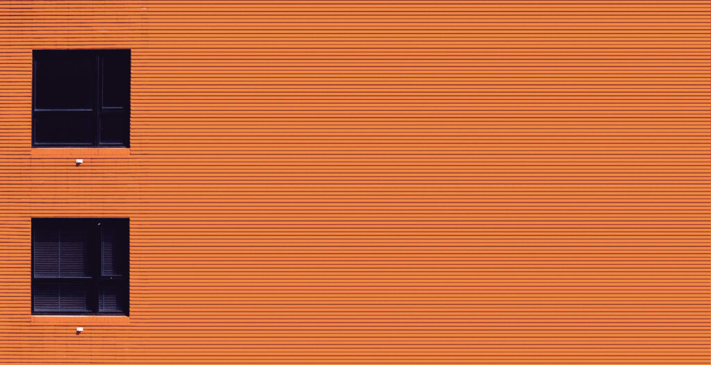
COLOR PSYCHOLOGY | ORANGE

The language of colors is the language of moods, and each color has thousands of faces.
Intuitive choice of colors – a subconscious hint of our state of mind.Orange is a color accent solutions, saturation without aggression and great energy.
In 2021, according to Pantone, it became the most popular color in the world, and for many brands – a standard and status for decades.The color of happiness, balance, warmth, playfulness, style and modernity.Orange is associated with success, determination and self-expression.

The purpose of orange in the interior-accent. It is most often used for accessories, decor elements, textiles, etc. Ideal color for rooms such as a kitchen, a dining room, an office or work area.
Psychologists have proved that the orange color improves appetite and raises the tone. This shade has taken over almost all the properties from red and yellow, because it is intermediate between them. Orange color will add inspiration and set to positive emotions. It is a social color that helps people open up and expand their communication.

The most harmonious combination of orange – a combination of rich color with neutral, pastel shades; and so that your own space looks stylish , the best thing to do is to choose gray tones.
The contrasting color will be blue with all its shades. The combination of orange and blue is associatively perceived as the sea and the sun. A universal option is to combine terracotta paired with steel shades of blue. It looks luxurious, especially if you pay attention to the textures.

To breathe life and freshness into a room – the main task for orange. If a room or windows face the north, it is enough to add a couple of solar accessories or highlight the bed wall. Orange blinds will look good in the interior.
For the bedroom one should choose pastels shades: peach, apricot, salmon.


